01 — Brand identity
MARK
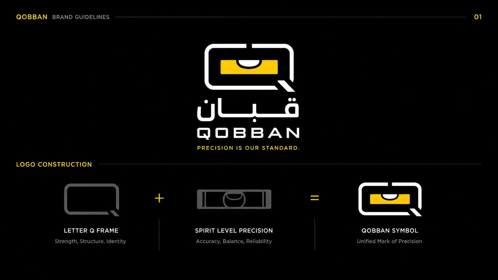
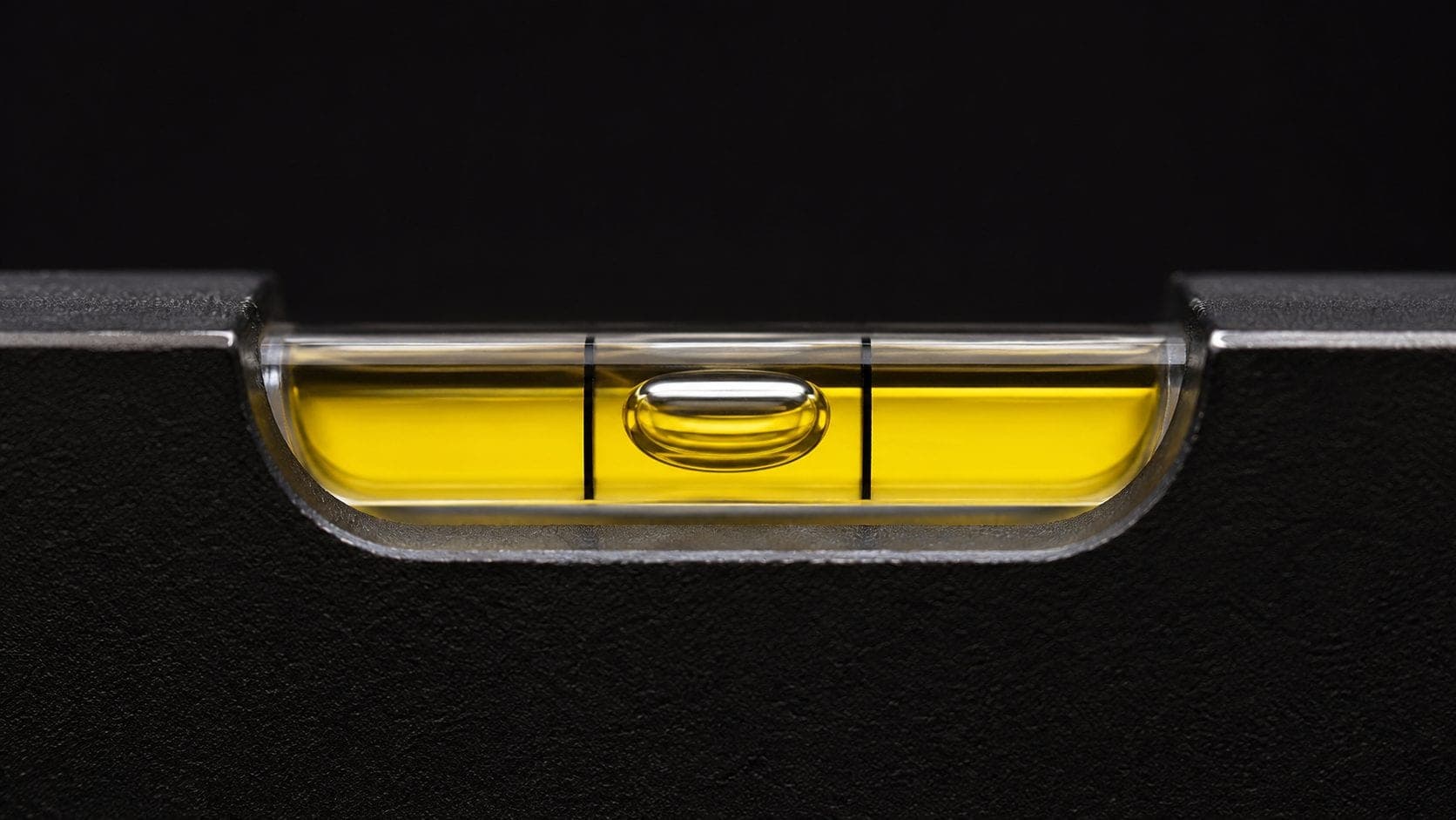
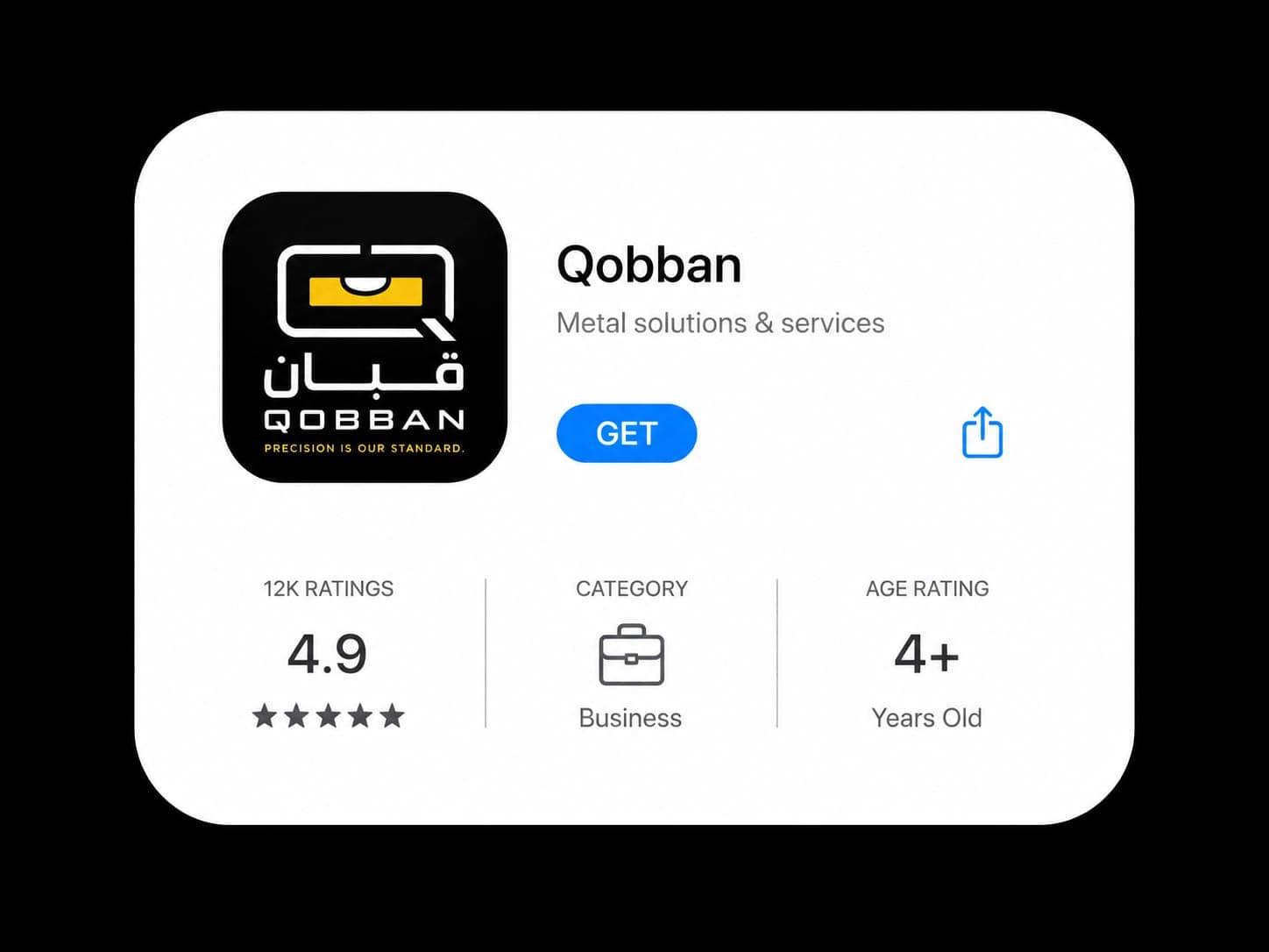
A letter Q built around a spirit level: the tool the trade actually measures with, made into the thing the business is recognised by. Precision as a mark rather than a promise.
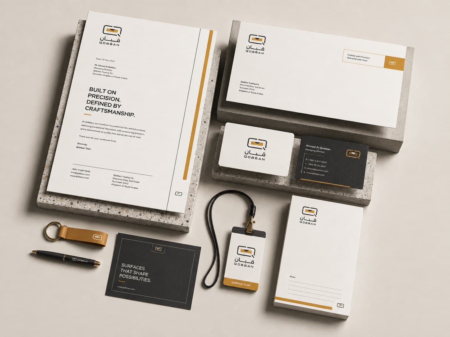
A fabrication and welding workshop that read as a general workshop — repositioned with a full identity across the premises, the marketing, and the website.
01 — Brand identity
A letter Q built around a spirit level: the tool the trade actually measures with, made into the thing the business is recognised by. Precision as a mark rather than a promise.
02 — Branding
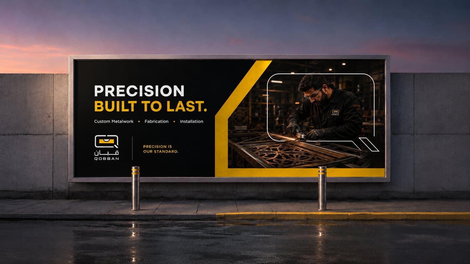
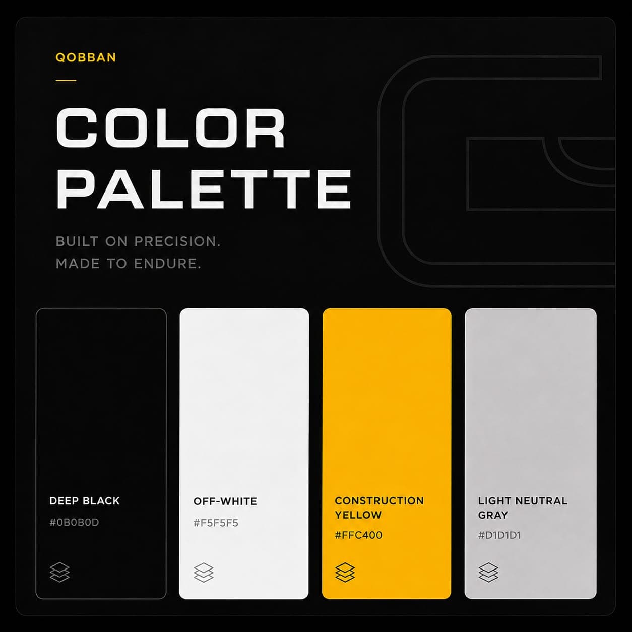
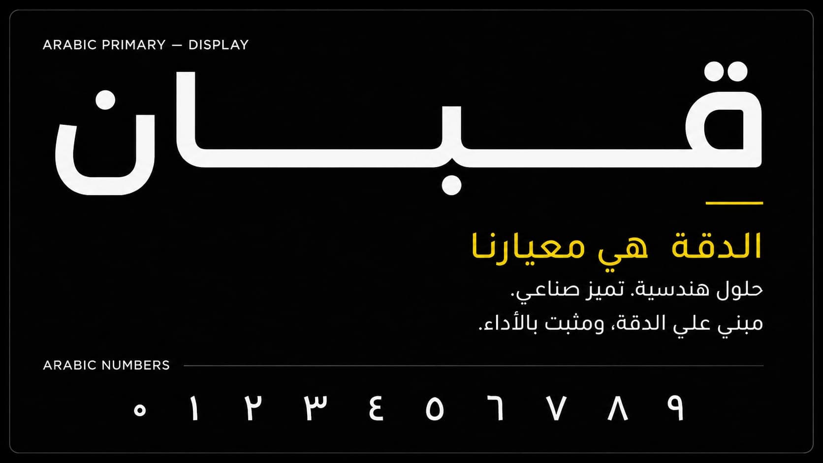
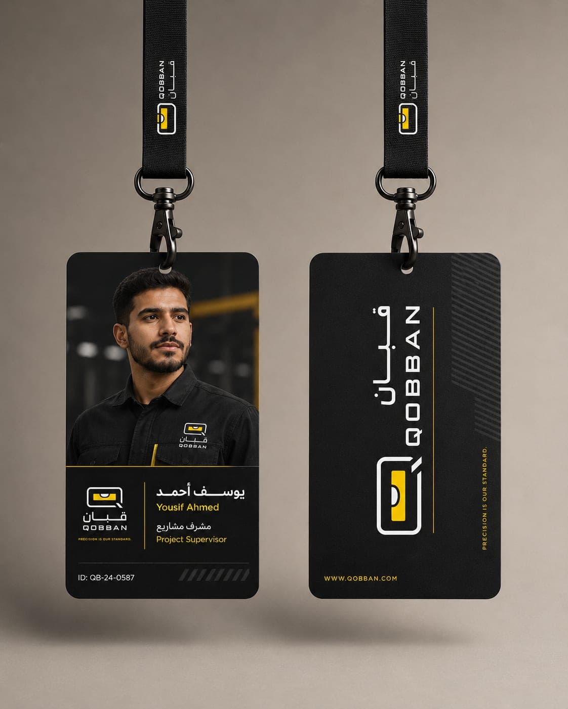
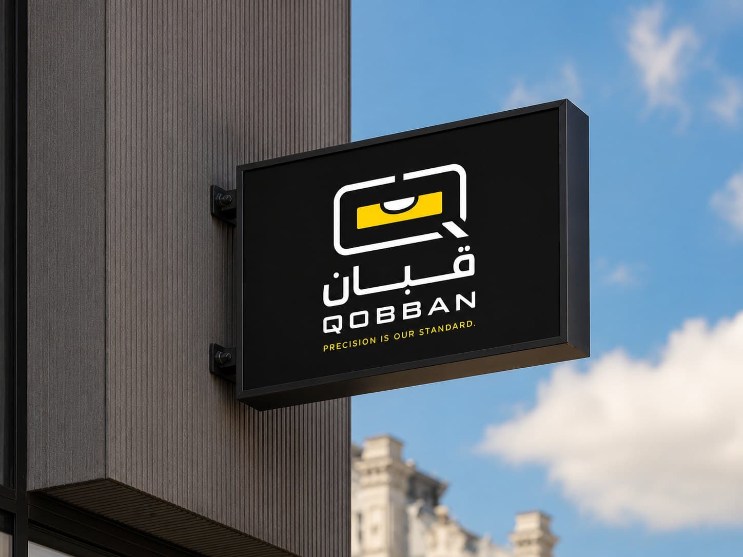
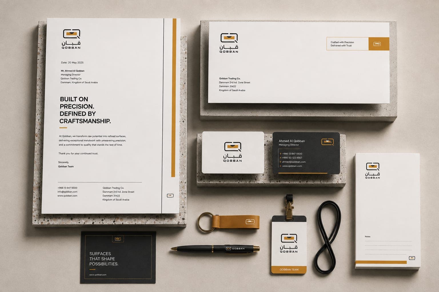
A mark is one shape. A system is what makes it usable everywhere — the pattern, the palette, and the rules that keep them consistent across every surface the business puts its name on.
03 — Social & campaigns
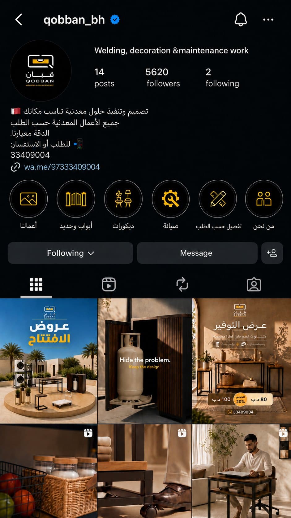
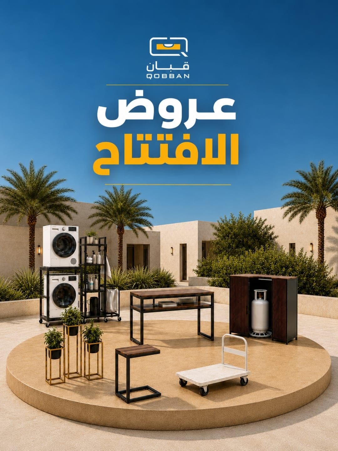
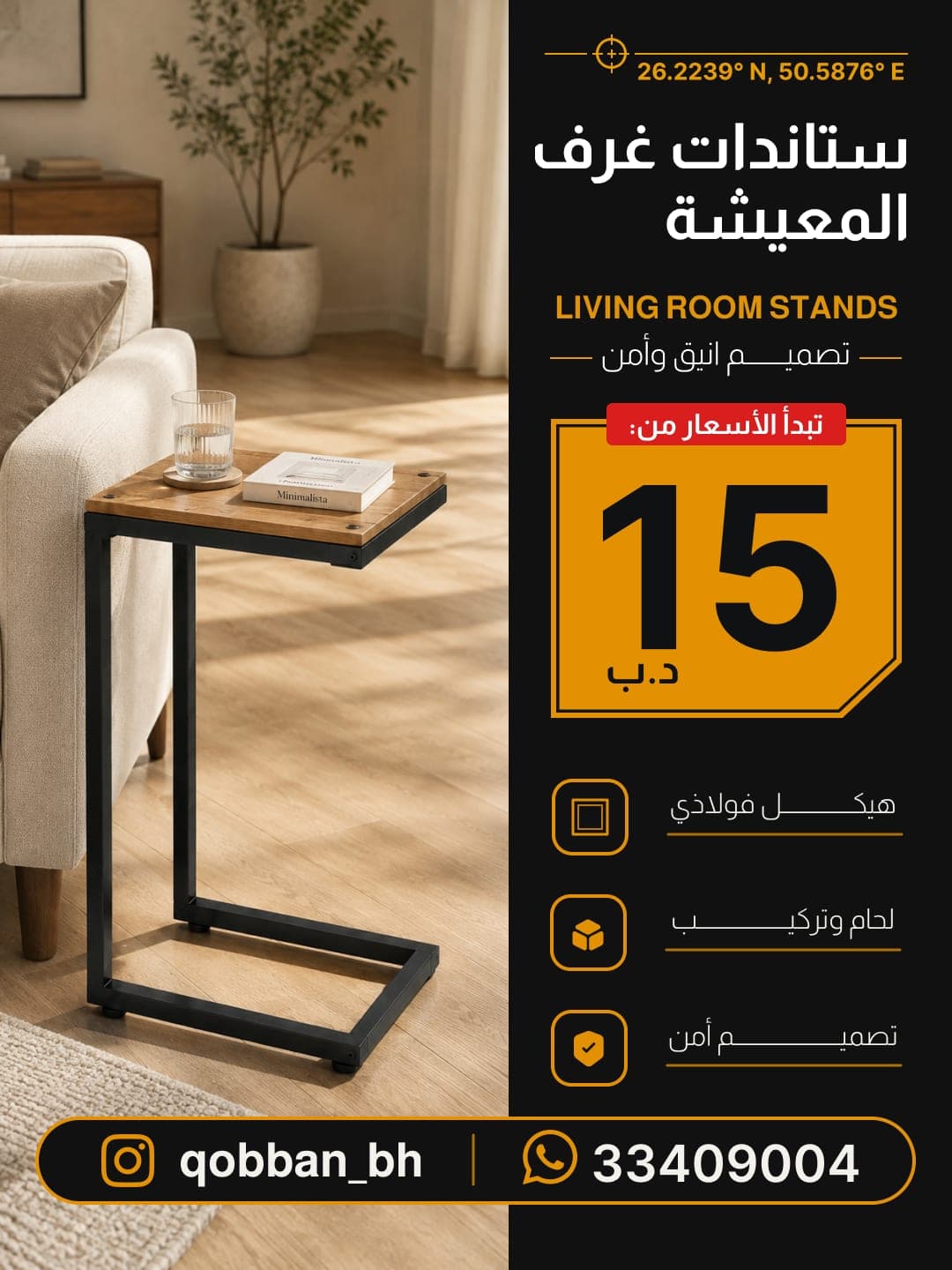
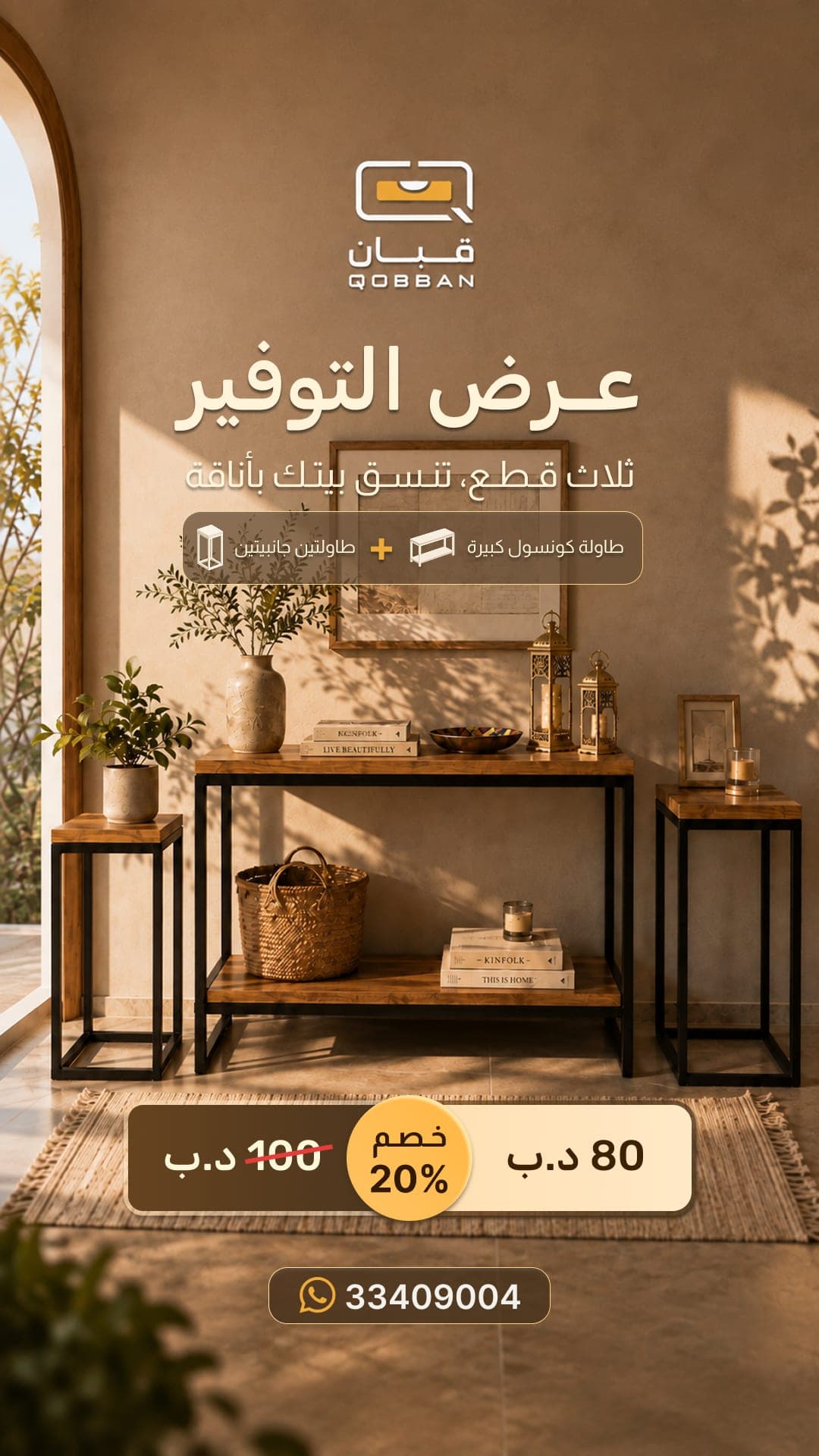
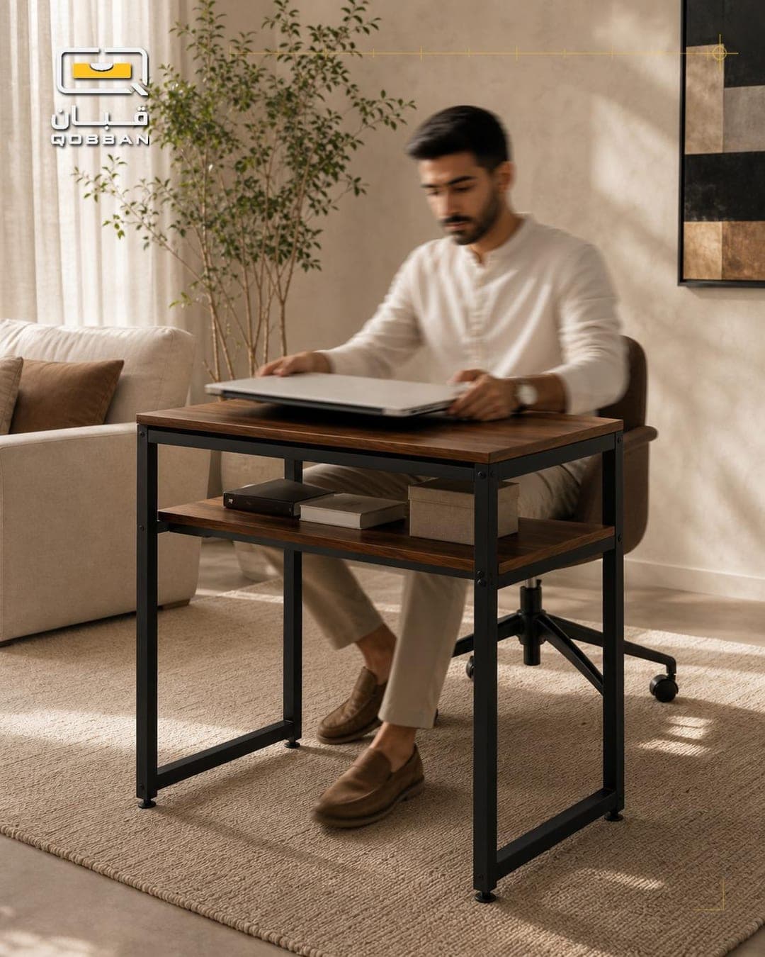
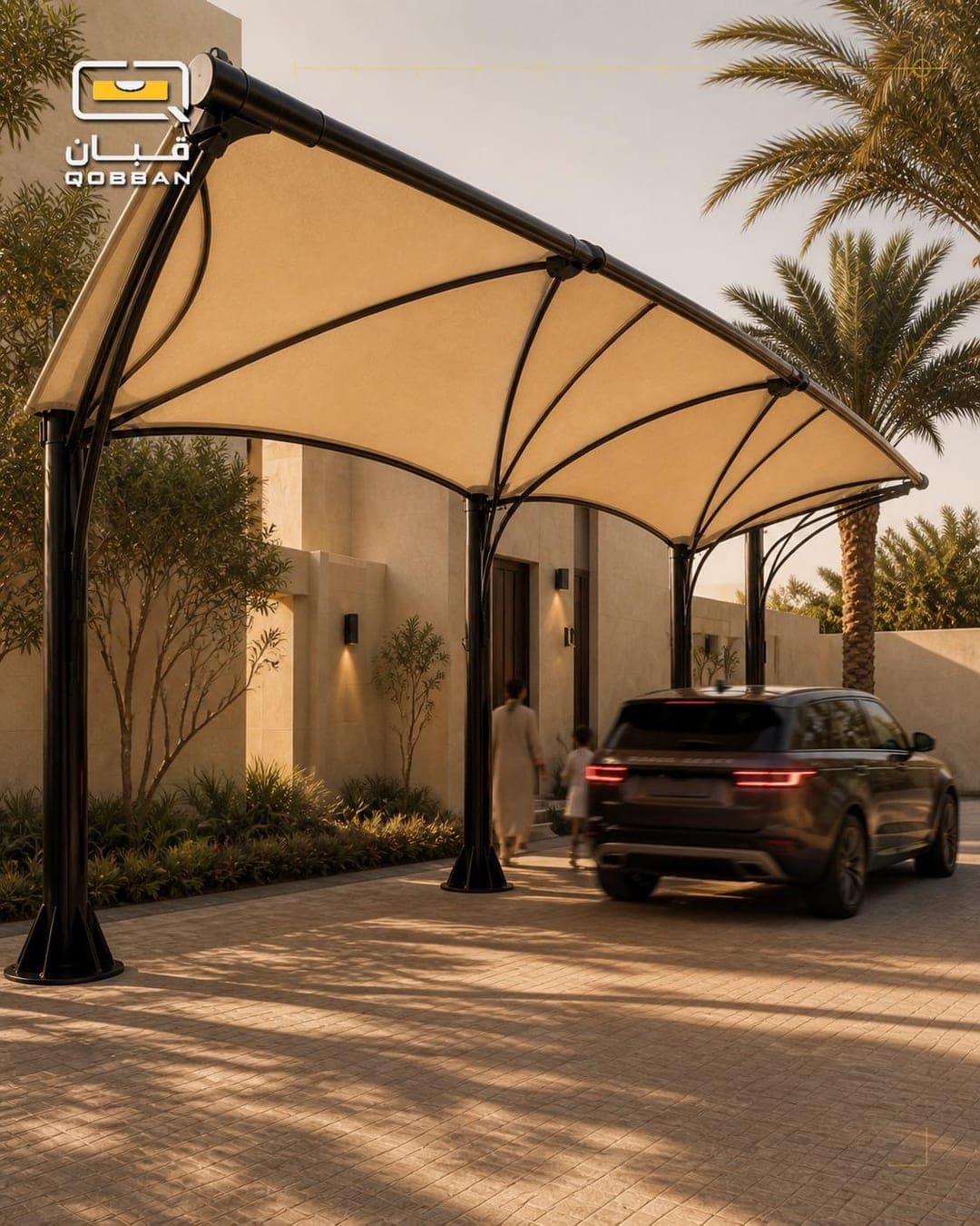
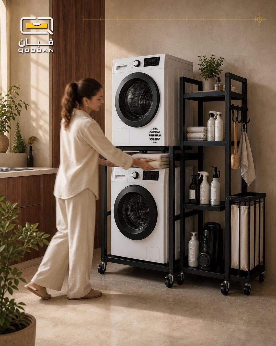
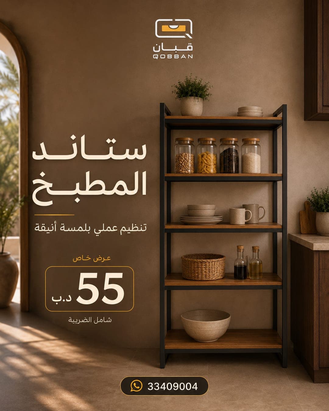
The identity at post scale, where most of a local audience actually meets this business — content and campaign creative built from the same system rather than decorated to match it.
Posts & stories
Campaign film
04 — Website
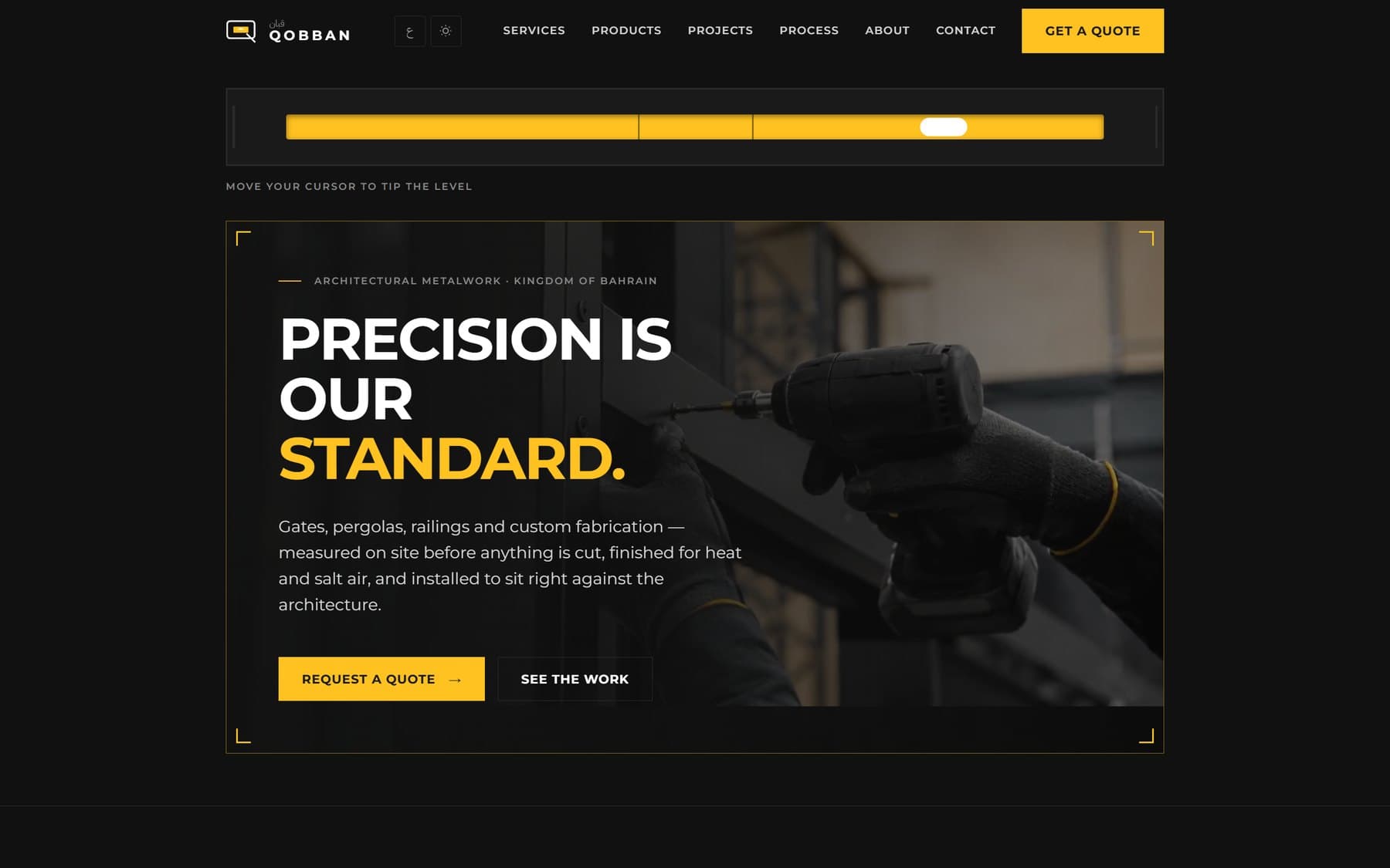
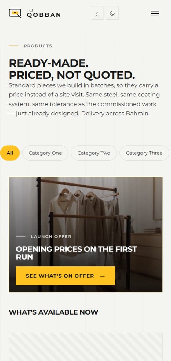
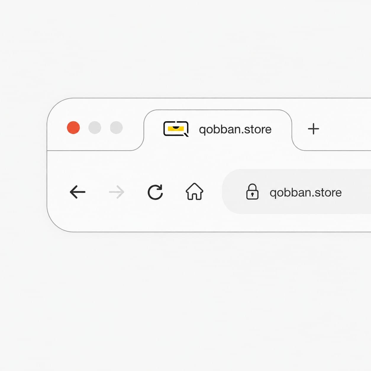
A site that shows the craft rather than listing services: fabrication, welding, architectural metalwork and maintenance, presented so a client can tell the standard before they call. The spirit level runs across the top of the page and tips with the cursor — the mark, made operable. A second page sells ready-made pieces at a stated price, for the work that does not need a site visit.
05 — Premises & workwear
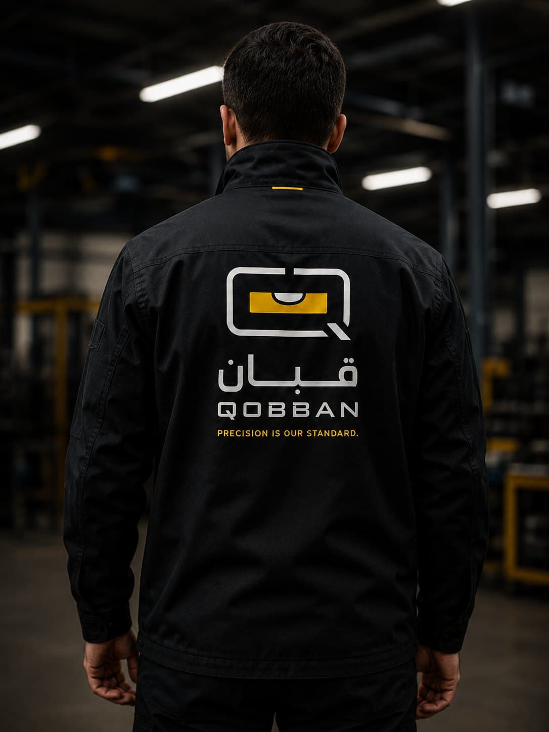
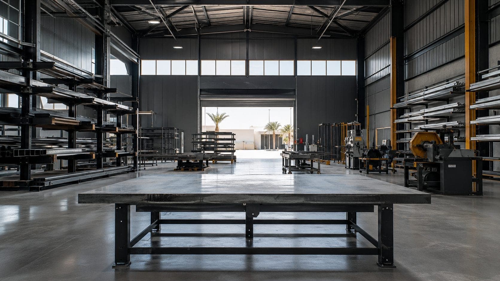
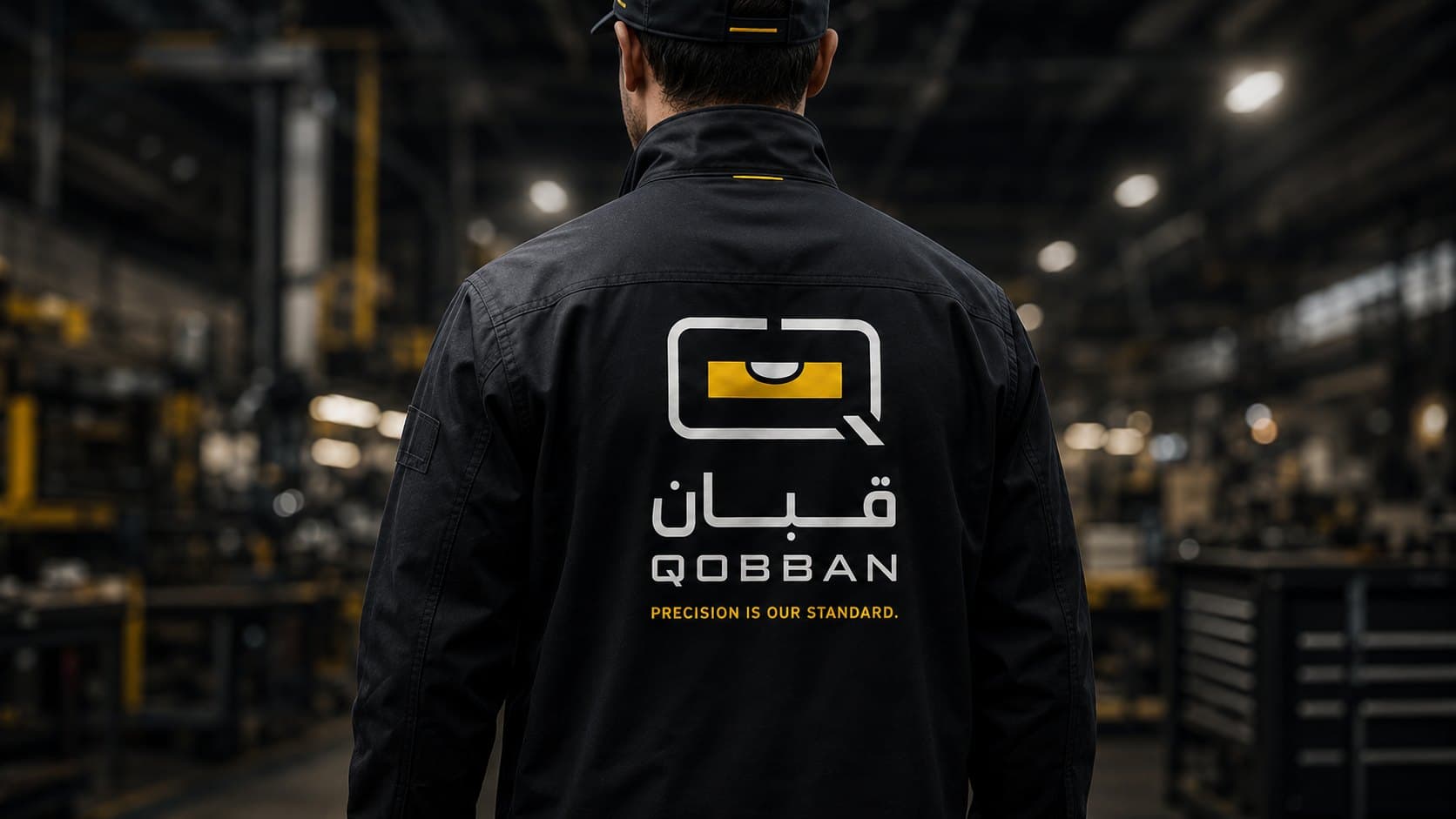
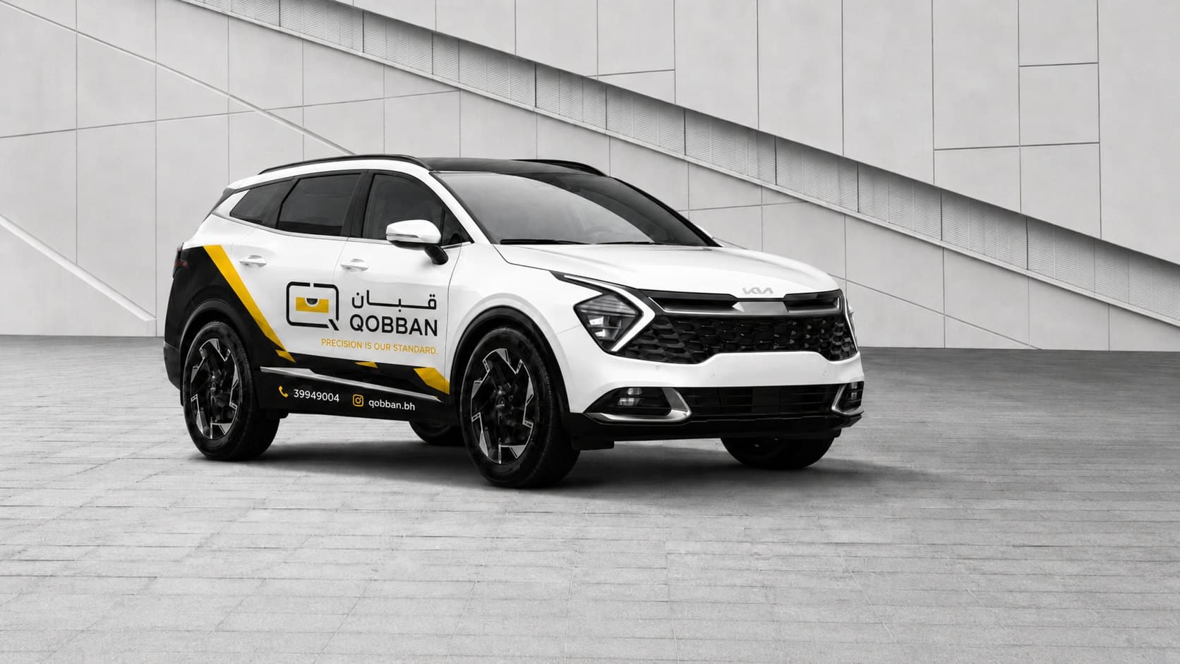
The identity had to survive where the work happens — the workshop, the workwear, the vehicle on the street. A client meets this business at a half-built villa long before they meet a brochure.
A first conversation is a conversation — what the business is, where it’s going, and whether the way it looks is keeping up.